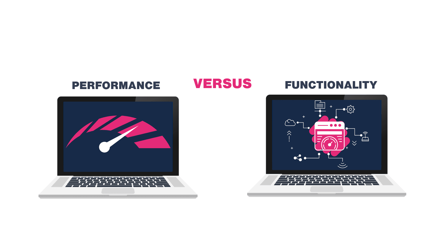
Looks Great... But Is It Working?
A lot of business websites look professional. They’re clean, they’re on-brand, and they tick all the right boxes visually. But behind the scenes? They’re doing nothing.
They’re brochure sites — static, passive, and built to inform rather than convert.
The problem? Websites shouldn’t just sit there. They should work.
Whether you're a B2B business, a local service provider, or a growing startup — your website should be your best salesperson, working 24/7 to generate leads, qualify interest, and start conversations.
If your site isn’t doing that, here’s how to fix it.
1. Add Clear, Compelling Calls-to-Action
Most brochure websites fail because they don’t guide the visitor anywhere.
Contact Us” in the menu isn’t enough. You need CTAs that prompt action — on every key page.
Try:
- “Get a Free Quote”
- “Book a Call”
- “Check Availability”
- “Download Our Brochure”
Bonus tip: test multiple CTA placements — hero, mid-page, and footer — to capture intent at different stages.
2. Add a Lead Magnet (Even a Simple One)
You don’t need a 50-page ebook. Sometimes, a one-page checklist or a useful pricing guide is enough to convert browsers into leads.
Examples:
- “10 Questions to Ask Before Hiring a [Your Service] Provider”
- “Pricing Guide 2025: What You Should Expect to Pay”
This gives you a way to start the conversation and stay top-of-mind with email follow-ups — rather than letting that visitor disappear forever.
3. Use Trust Signals and Proof Throughout
Brochure sites often throw all the testimonials on a single “Reviews” page. But smart sites sprinkle proof throughout the journey.
Add to:
- Your homepage
- Below CTAs
- Service pages
Also consider:
- Logos of clients or partners
- Case study highlights
- Industry accreditations or awards
4. Make Forms Frictionless
If your contact form asks for everything from someone’s date of birth to their blood type, you’re doing it wrong.
Reduce friction. Only ask what you truly need at first contact.
Make sure:
- It’s mobile-friendly
- It loads fast
- The CTA button is clear and benefit-focused
And if possible, offer alternative methods — like a calendar booking link or live chat.
5. Track What Matters
You can’t improve what you’re not measuring.
Install Google Analytics, set up goals (like form submissions or call clicks), and use tools like Hotjar or Microsoft Clarity to see how users interact with your site.
Even something simple — like seeing where people drop off — can help you plug the leaks and increase conversions.
Ready to Upgrade Your Website’s Day Job?
Brochure sites have their place — but if you want your website to drive real business growth, it needs to do more than just look nice.
By adding the right CTAs, trust signals, lead magnets and tracking, your site becomes a lead machine — not a digital ornament.
And if you’re not sure where to start? That’s what we’re here for.
Make the smart choice
The best websites don’t just look good — they’re built with purpose.
At Smarter Sites, we guide you through these questions as part of every project, helping you avoid the guesswork and build something that delivers real results.

About the author